History & Calendar
Zoom out. See your trading month by month, week by week, day by day — and spot the seasons, streaks, and slumps that a single equity curve hides.
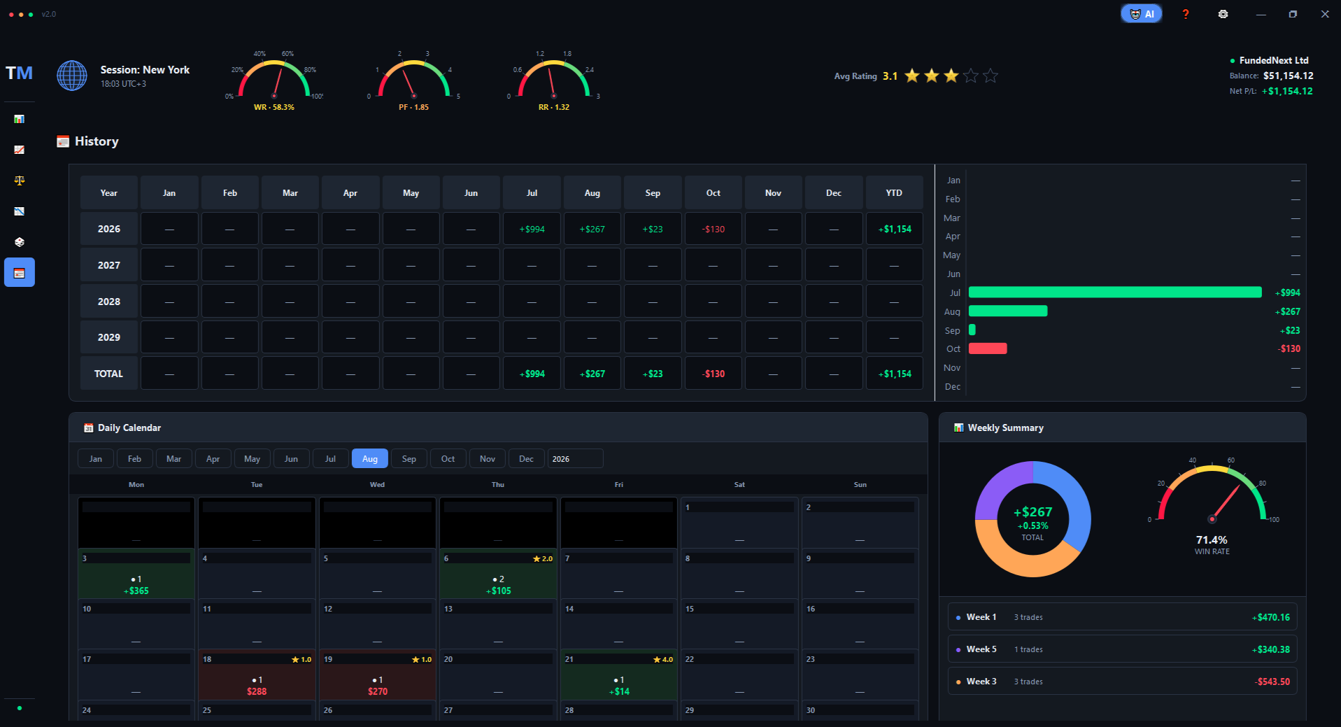
Three views, one page
The History tab is built for patterns across time — not just totals. Three connected sections show your performance at different zoom levels.
Annual Performance
Years × Months table with YTD totals. Scan three years at once to see seasonality and yearly growth.
Daily Calendar
Every day of the month as a colored cell — green for profit, red for loss, with the day's P&L and trade count.
Weekly Summary
Donut chart of weeks, winrate speedometer, and a sorted list of the month's best and worst weeks.
Click any day
Opens a detail panel with every trade of that day — comments, ratings, and quick access to charts.
Annual Performance
The table on the left shows your monthly P&L for up to 4 years, with green cells for profitable months and red for losing ones. The YTD column on the right gives you the yearly total at a glance.
Daily Calendar
Every day of the current month is shown as a cell. Cell colors reflect the day's P&L — soft green for profit, soft red for loss. Each cell also shows the number of trades and the day's P&L in dollars.
Days where you rated at least one trade show a small ★ badge in the top-right corner — a quick visual reminder of which days you reviewed.
Weekly Summary
The right column groups the month into weeks. A donut chart shows each week's contribution, and a winrate speedometer gives you the overall picture for the month. Below, a sortable list ranks the weeks from best to worst — with P&L, trade count, and win rate for each.