📊 Strategy Comparison
Performance Analysis
The "Comparison" tab allows you to deeply analyze your trading across various dimensions and identify the strengths and weaknesses of your strategy. Everything is laid out in a clean 2×2 dashboard: equity chart, annual performance, win rate by symbol, and the unique Survival Index.
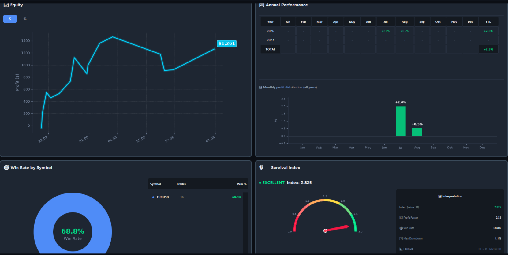
"Comparison" tab — 2×2 dashboard with equity, annual performance, win rate, and survival index
📈 Equity Chart
The top-left block shows your equity curve — how your account has grown (or declined) over time. Switch between two display modes:
💰 $ Mode
View your profit in US dollars — see the real monetary result of your trading.
📊 % Mode
View your profit as a percentage of initial balance — compare strategies objectively regardless of account size.
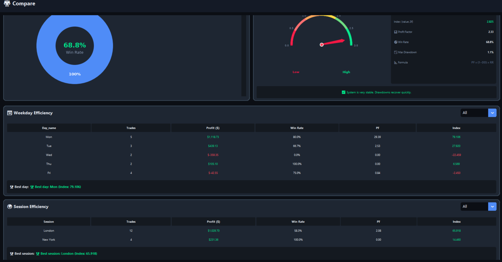
Equity chart — switch between $ and % modes with a single click
📅 Annual Performance
The top-right block displays a year-by-year breakdown of your returns. Each cell shows the return for a specific month, and the YTD column shows the total return for the year.
Below the table, you'll see a monthly profit distribution histogram — a visual summary of which months performed best across all years.
🎯 Win Rate by Symbol
The bottom-left block shows which instruments you trade best. The donut chart displays your overall win rate, and the list below breaks it down by symbol with color-coded indicators:
- 🟢 Green — win rate ≥ 60% (strong performance)
- 🟡 Yellow — win rate 50–60% (average)
- 🔴 Red — win rate < 50% (needs attention)
Use this block to identify which pairs work for you and which drag your performance down.
🛡️ Survival Index
The bottom-right block shows a unique metric that evaluates the stability of your strategy. The speedometer visualizes the current value, and the interpretation table breaks it down into key components.
📐 Formula
Survival Index = PF × (1 − DD) × RR
- PF — Profit Factor (gross profit / gross loss)
- DD — Maximum Drawdown (in %)
- RR — Risk/Reward Ratio (average win / average loss)
📊 4 Levels of Evaluation
🟢 EXCELLENT (≥ 1.5)
System is very stable. Drawdowns recover quickly.
🟡 GOOD (≥ 0.8)
System is stable. Good balance of risk and reward.
🟠 SATISFACTORY (≥ 0.4)
System works, but risk is moderate. Consider optimization.
🔴 NEEDS ATTENTION (< 0.4)
System needs attention. Review your strategy and risk management.
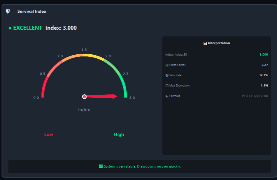
Survival Index with speedometer and interpretation
📆 Weekday Efficiency
Analyze which days of the week bring the most profit. The table shows:
- Trades — number of trades on that day
- Profit ($) — net profit after commission and swaps
- Win Rate — percentage of winning trades
- PF — Profit Factor for that day
- Index — combined efficiency metric:
(PF + EV) × (trades / total)
Use the dropdown at the top-right to filter by a specific symbol, and see the 🏆 Best day summary at the bottom.
🌍 Session Efficiency
Compare your performance across the 3 main trading sessions:
- 🌏 Asia — 00:00–08:00 UTC
- 🌍 London — 08:00–16:00 UTC
- 🗽 New York — 16:00–24:00 UTC
Same metrics as Weekday: Trades, Profit, Win Rate, PF, Index. Plus the 🏆 Best session indicator.
🔒 TradeMetrics — Professional Trading Journal